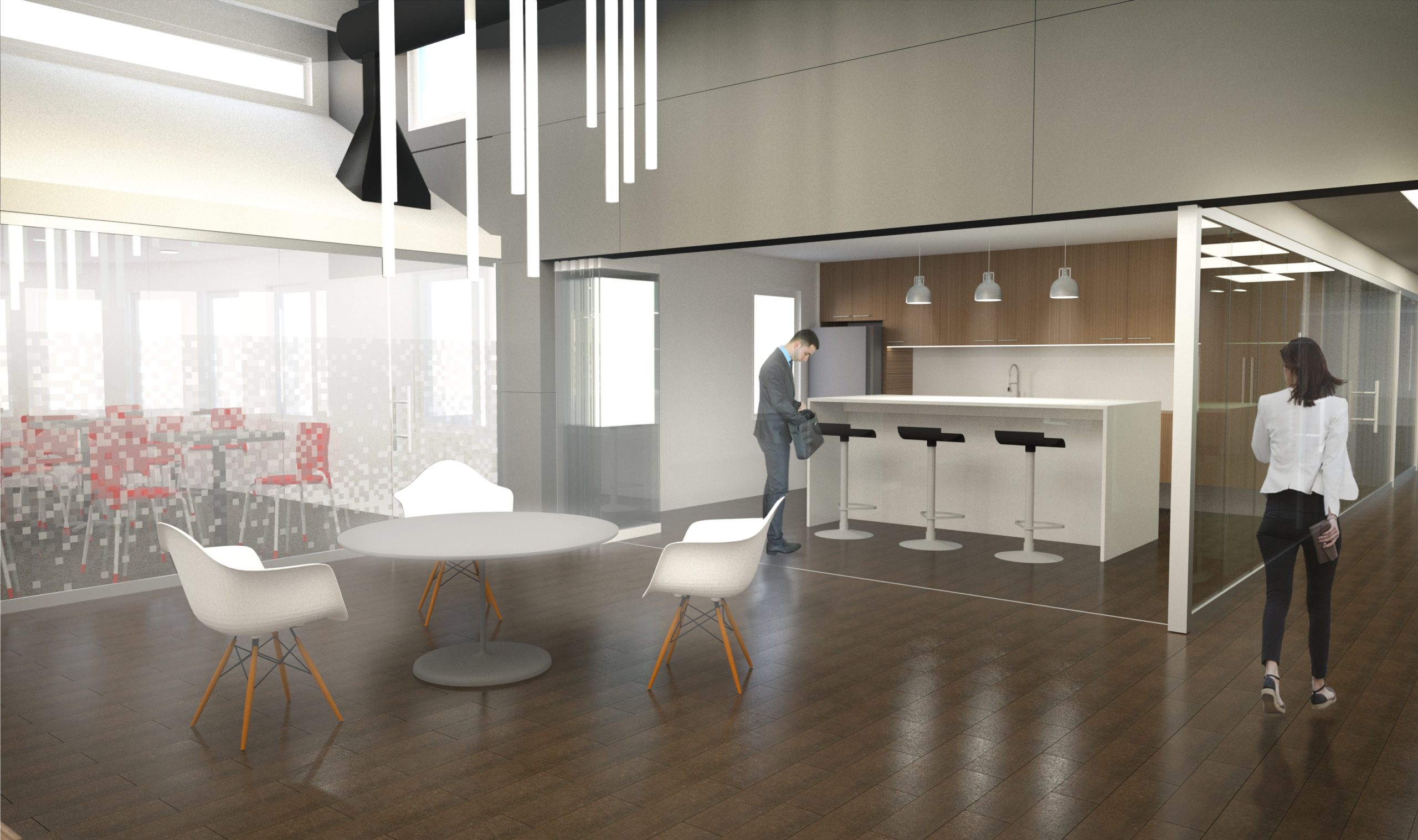
Office Remodel
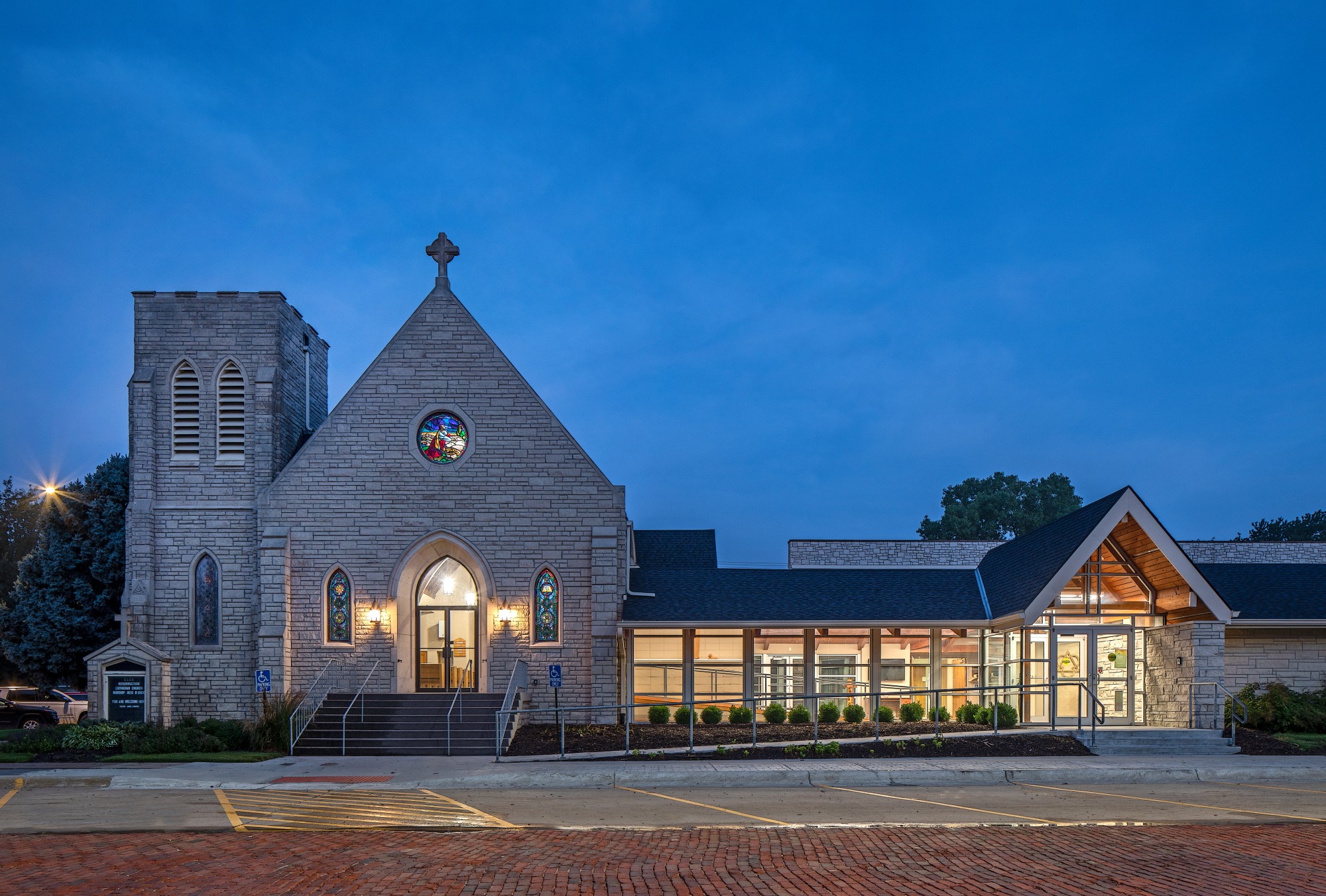
The church sought to refresh the narthex so that it would accommodate an accessible ramp, and enjoy the appeal of more contemporary materials. Previously, it was not obvious to visitors that the narthex was the main entry, but by replacing the existing colored panels with aluminum storefront windows, the space has a brighter more inviting presence. Walls and windows were appropriately rearranged to make the space more airy and consistent with the feel of the fellowship hall. Additionally, the church needed to address concerns about poor drainage, which was solved by providing shading and by increasing the amount pervious coverage on the site. The design creates a dialogue with the existing roof structure, keeping with the traditional feel while providing clean lines and accentuating the narthex as the main entry. The overall result is a warm, inclusive, and inviting space for church goers to feel welcomed by.
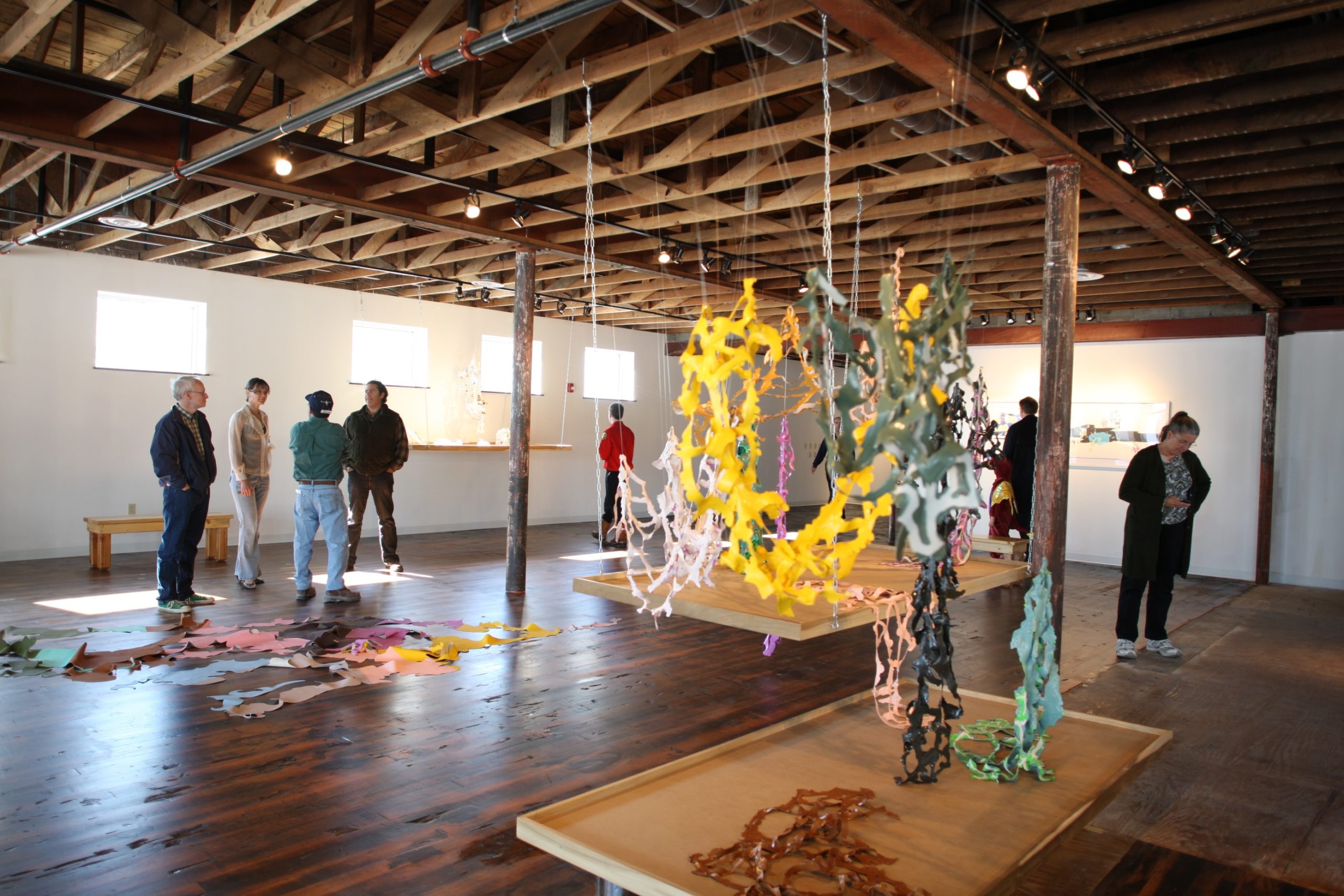
10th and Bancroft is an adaptive reuse of an historic, utilitarian building in downtown Omaha. The original masonry and wood structure was built in 1895 as a neighborhood grocery store. But after more than 100 years of service to the local community, the store closed and the building sat vacant for several years.
The building was eventually acquired by an attorney for conversion to an art studio. The architects decided to celebrate the simple beauty of the historic building by exposing the original roof structure, expressing the steel columns, and removing a later-added linoleum floor to expose the original wood planks while updating the building’s thermal and moisture-control qualities, reconfiguring the spatial planning to fit it’s new use as an art studio, and adding plentiful natural light to the building. The overall result is a simple, flexible space that retains its historic beauty while meeting a very tight budget.
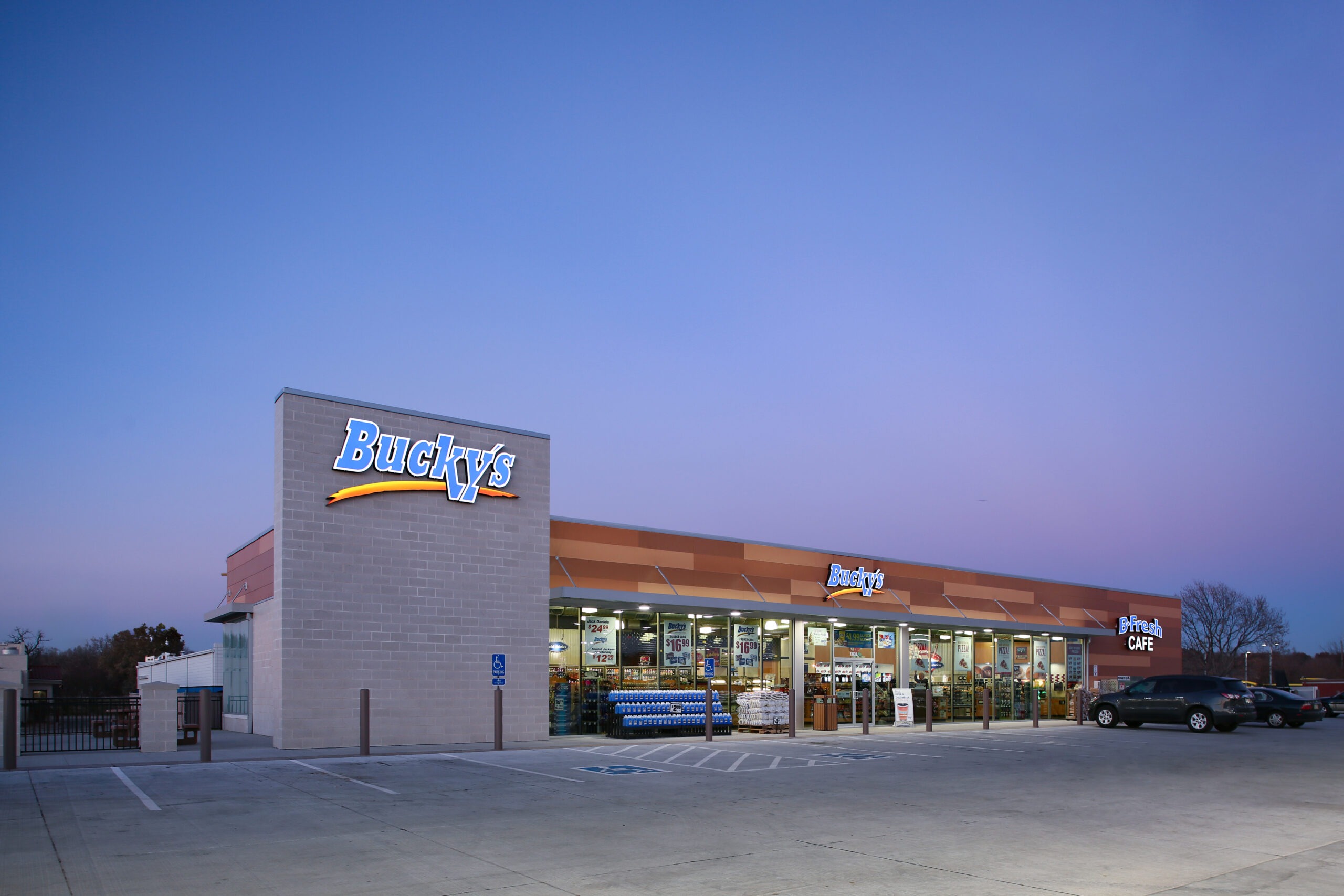
When Bucky’s Convenience Stores decided to upgrade their brand identity with a new C-store prototype design, they came to us for fresh, creative concepts. We aggressively generated schemes with wide-ranging inspirations from historic to retro to modern.
A variety of these initial concepts were refined before the “Simple Modern” concept rose to the top of the stack. That design successfully blends Bucky’s goals; it portrays a fresh and modern image, creates buildings that are light-filled and comfortable and is composed if durable, low-maintenance materials. The first prototype store was opened in Omaha in 2013. Bucky’s are now adapting the prototype for sites throughout the Midwest.
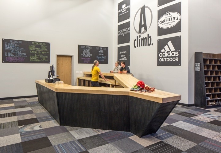
With no public climbing gyms in the city, Approach sought to create a bright, welcoming environment that would capitalize on the growing popularity of climbing and allow Omaha’s more adventurous residents a place to hone a new skill.
To engage with that public, vibrantly colored walls were arrayed along the length of the space, each facing the broad glass facade and turning each climb into a spontaneous performance that draws in onlookers from the street. Once inside, the sharp folds of the reception desk cling tightly to the point of service space, the concealed equipment return, and the snack bar, twisting and oscillating in size to fit each function. The collective angular form seems to lunge outward at arriving guests in complimentary anticipation of the climbing walls beyond. Together, all of the individual elements speak to a singular sense of place, an invitation to climb.